R Tutorial for
Retail Analytics
Retail Analytics
Kellogg School of Management
Professor Brett Gordon
December 14, 2018
Introduction
The purpose of this tutorial is to provide you with a solid understanding of how to R in Kellogg’s Retail Analytics course. This is not intended as a general R tutorial. The focus is on those concepts necessary to understand the lecture material and to complete the assignments.
Before using this document, we strongly recommend that you follow the steps in the file “R_RStudio_Software_Setup.pdf”, which is titled “Setting up R and RStudio”. In addition to helping you install both R and RStudio, that document helps you create a new RStudio Project for the course and compile your first R Markdown document, which both verifies your installation and installs packages necessary for class (e.g., tidyverse, readxl, and others). A package in R is a collection of functions, data, and compiled code that fulfill a specific purpose. Part of R’s power is that a huge community of developers exist that contribute packages for free.
If you are interested in learning more about R, many great and free resources can be found online. Here are some that we recommend:
- DataCamp - Introduction to R (this is free)
- R for Data Science (from the authors of the
tidyversepackage) - University of Cincinnati Business Analytics R Tutorial (click the icon at the top left to see all the material)
Recommended R Markdown tutorials:
If you can’t find the answer in one of these, searching online for whatever R question you might have is bound to turn up many results. You can also get help by typing ?command or help(command) in the console.
How do R and Stata differ? You might be familiar with Stata from other courses. Both R and Stata are statistical software, but they differ in a number of significant ways. At a high level: R is free, open-source software, whereas Stata requires a paid license; R is a more fully-developed programming language that can easily connect to other languages (e.g., Python, SQL); R is now widely used in the business world.
The two programs operate on data in fundamentally different ways. Stata operates on a single data set (table) at a time stored in memory. Performing operations on a different data set requires the user to offload the current data set and to read in a new data set. In contrast, the R environment can simultaneously store in memory many different variables, or objects. These variables can represent a variety data types, including data tables, and there is no need to “load and offload” data when you want to switch between tasks.
RStudio
Before delving into programming with R, it’s important to understand how to use RStudio. First, RStudio and R are not the same! RStudio provides convenient access to R through a graphical interface, as well as numerous other benefits. You need to install both R and RStudio, and we recommend installing R first.
When you first open RStudio, you will see a window similar to this:
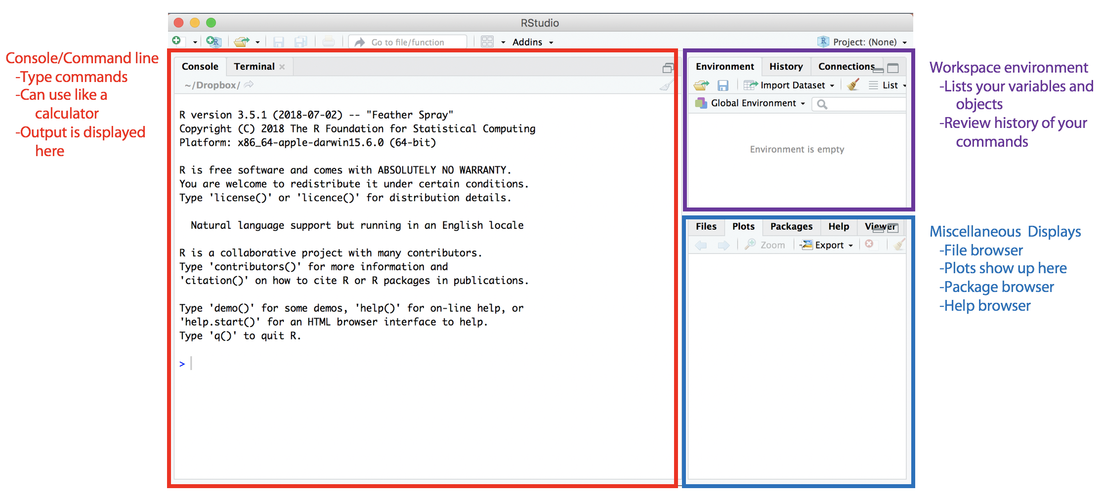
The left side contains the console, which operates much like a calculator. You can enter commands directly into the console for R to execute. The workspace environment at the top right displays the variables (data) that exist in the current work environment (stored in your computer’s RAM). These are variables that are accessible to you in the console and in any scripts that you run. In the history tab, you can view a list of your previous R commands. The bottom right contains multiple tabs, including where plots are displayed and the list of installed packages can be found.
An important tab is the help tab. In the console, type help(dir) and hit enter. You will see the help information for the dir() function displayed in the help tab. Alternatively, you could have typed ?dir to view the help.
You can change the size of these windows and they can be arranged differently by going to Rstudio|Preferences|Pane Layout. If you close a window by mistake, you can always reopen it using the View menu. We need to distinguish between two types of files you will see: R source files with an .R suffix and R Markdown script with a .Rmd suffix. We discuss each of these next.
Creating an R script
An R script, or an R source code file, is basically a text file that stores R code (similar to the way that a do file stored Stata code). To create a new .R file in RStudio, go to File|New File|R Script. This will open a new script file called “untitled1.R” in the script editor, which is used to edit new or existing R scripts.
Type the following lines into the new file:
x = 5
y = 10
z = x*y
z
Before we continue, a note on the formatting in this document. The lines above have not been run or executed, even though they appear in a gray box. In section 2.1, you will begin to see gray boxes with code that was run, with the output appearing in the line below the code.
After you have entered these lines into the code file, highlight all four lines and click the “Run” button at the top. This will cause R to execute the highlighted code. Below is how your RStudio should look:
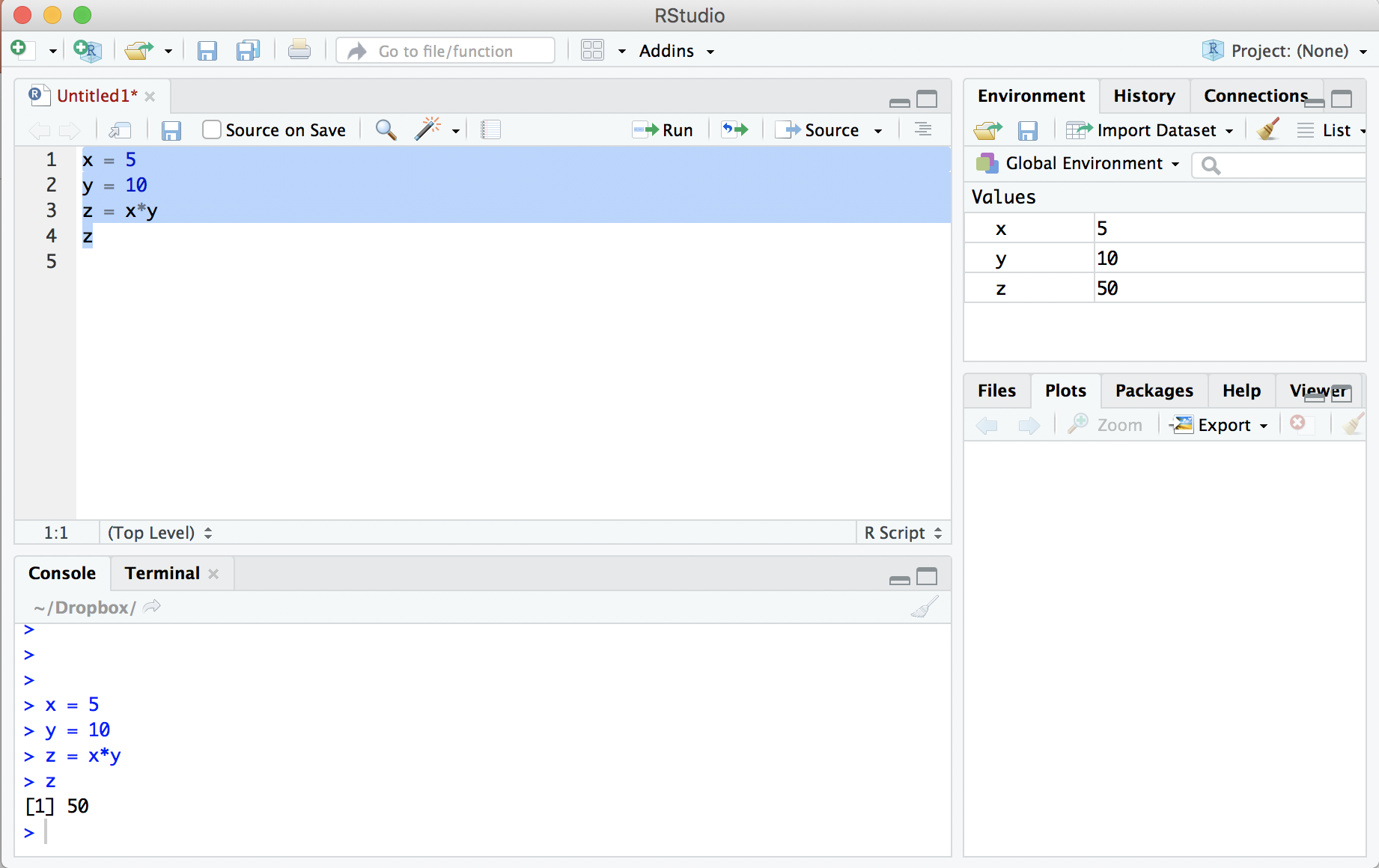
Four important points to note:
- R executed the four lines of highlighted code in the console window.
- The code created three variables and assigned them values using the
=operator, printing the value ofzat the end. - The environment tab in the top right now indicates the existence of the variables and their values.
- We could have typed those four lines of code directly into the console and achieved the same result. You can think of the console like a calculator. The benefit of using the .R file, however, is that you can save your work to run again in the future.
Before saving this file, you should comment your work. Any piece of R code that is preceded by one or more # is treated as a comment and will not be executed by R. Before saving the code we ran above, we might want to add a comment at the top:
# This is my first R code example
x = 5
y = 10
z = x*y    # This is a comment, too
z          # This line prints out the value of z
Including comments is not only considered good coding etiquette, but it is especially helpful when you need to return to code you’ve written after some time or when you are working with other people who need to understand what you did. Thus, we strongly recommend that you include comments in your work. Finally, save the file by going to File|Save.
Creating an R Markdown script
An R Markdown document is a dynamic document that contains a mix of markdown and R code. Markdown is a simple text markup language that allows you to specify different elements in a document (headers, bullet lists, graphics, etc). These elements can be woven together to produce output as webpages (HTML), PDFs, or Word files. Part of their power lies in the fact that they join together reporting and analysis: your analytics and discussion are contained in the same document.
To create a .Rmd file in RStudio, go to File|New File|R Markdown. This will open another dialog box asking you to give a title to the new document. If you have already followed the steps in the guide on “Setting up R and RStudio”, you should create this new document under the RStudio Project directory for this course. Next, change the default output format to PDF and hit enter.
After opening a new markdown file, RStudio will look like this:

RStudio loads a template .Rmd file that you can save in your course directory (either File|Save or click on the disk icon). Next, click on the “Knit” button near the top left. A new tab should appear called R Markdown with various output scrolling through it, after which a new window will open with a PDF:
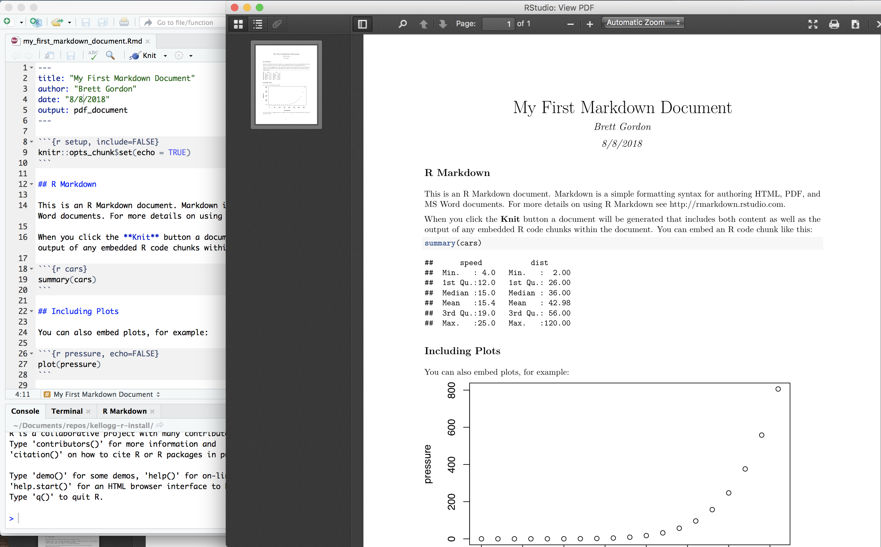
Congrats! You’ve just compiled an R markdown document into a PDF.
As you will see, one of the benefits of R Markdown is that you can centralize your analysis of the data and your write-up of the analysis. There is no need to analyze the data in one piece of software and to write the report discussing the results in another application. Doing so creates extra work and increases the likelihood of errors. R Markdown improves the reproducability of your work.
Basics
This sections covers the basics: the basic types of data, how to assign and extract the values of variables, using factors to make it easier to deal with categorical variables, how to create and manipulate data frames (you will use these a lot), and how to read and write data from/to files (e.g., xlsx, csv). Most of the content in this section will be fundamental for your general usage of R.
Date types
Numerics, characters, logicals and vectors are four of the most fundamental data types in R (and common in other programming languages as well):
- Numerics - Numbers such as
2.4are called numerics, or doubles. Integers, such as2, are also considered as numerics unless you explicitly identify them as an integer. - Characters - Text or string values, like
"brand", are called characters, and must always be surrounded by quotes"to be considered a character. R allows you to use either double or single quotes, but of course they must be used in pairs. - Logicals - Boolean values,
TRUEorFALSE, are called logicals. Note that these two words are special: they do not have quotes around them. R knows to interpretTRUEandFALSEas the equivalent of1and0, even without quotes. Both boolean values can be abbreviated asTorF. Warning: NEVER useTorFas the name of a variable! - Vectors - A vector is a set of elements that all have the same type, such as numeric, character, or logical.
Vectors are a basic building block for all data types in R. For example, in section 1.3, we defined a variable z = x*y = 5*10. Typing z in the console produces this output:
z
[1] 50
The “[1]” is present because z is actually a vector of length 1 and 50 is the value of the first (and only) element in that vector.
Creating Vectors. We can create vectors using the c() function1:
c(1, 2, 3, 4, 5, 6, 7, 8, 9, 10)  # Vector of integers (numerics)
 [1]  1  2  3  4  5  6  7  8  9 10

c("Retail", "Analytics", "Marketing")   # Vector of characters
[1] "Retail"    "Analytics" "Marketing"

c(TRUE, FALSE, FALSE, TRUE)  # Vector of logicals
[1]  TRUE FALSE FALSE  TRUE
Note that “[1]” is a marker of the element index, not the vector’s length. To see this, let’s print a vector with all the numbers from 1 to 100:
c(1:100)   # Note the use of ':' to do this
  [1]   1   2   3   4   5   6   7   8   9  10  11  12  13  14  15  16  17
 [18]  18  19  20  21  22  23  24  25  26  27  28  29  30  31  32  33  34
 [35]  35  36  37  38  39  40  41  42  43  44  45  46  47  48  49  50  51
 [52]  52  53  54  55  56  57  58  59  60  61  62  63  64  65  66  67  68
 [69]  69  70  71  72  73  74  75  76  77  78  79  80  81  82  83  84  85
 [86]  86  87  88  89  90  91  92  93  94  95  96  97  98  99 100
By default, these vectors are column vectors. Although the elements in the console are printed horizontally, across the line, you should picture each vector as a column—like a column of cells in Excel. We can join together multiple vectors by column using cbind():
a = c(1, 2, 3)
b = c(4, 5, 6)
c = c(7, 8, 9)
abc = cbind(a,b,c)
abc
     a b c
[1,] 1 4 7
[2,] 2 5 8
[3,] 3 6 9
Alternatively, we can join these vectors by row using rbind():
abc = rbind(a,b,c)
abc
  [,1] [,2] [,3]
a    1    2    3
b    4    5    6
c    7    8    9
Assigning values and accessing values
Assigning values to variables is done using the assignment operator =, which stores their value for later use.
# Create a numeric variable.
# Technically, this is a vector of length one
x = 10

# Print its value in the console
x
[1] 10
# Create a numeric vector with three elements
y = c(10, 20, 30)
# Find out the vector's length
length(y)
[1] 3
# Print its value in the console
y
[1] 10 20 30We can access elements of a vector in the following way:
# Access the first element of y
y[1]
[1] 10

# Access the third element of y
y[3]*x + 7
[1] 307

# Square all elements in y
y^2
[1] 100 400 900
There is a second way of assigning values in R, using <- instead of =. There is a slight distinction in the way each works, but it is not important for our course. You should be safe if you always use =.2
Relational and logical operators
All the usual relational operators exist in R:
<less than>greater than<=less than or equal to>=greater than or equal to==equal to (Note: this is not the same as=which assigns values)!=not equal to
To create logical conditions (e.g., “Retain rows where the brand is Coke AND the year is 2017”), we use logical operators:
!NOT&AND|OR
For example, recalling that x=10 and y=c(10,20,30),
x > 0
[1] TRUE

x <= 0
[1] FALSE

x <= y[1]
[1] TRUE

(x <= y[1] & x > y[3])
[1] FALSE

(x <= y[1] | x > y[3])
[1] TRUE
Factors
Factor variables are designed to make it easier to work with categorical variables, which take on a discrete set of values and that may be non-numeric. For example, you may observe a variable merch that indicates whether a product had a special merchandising event in a period. In this case merch is a particular type of categorical variable called a binary variable. Alternatively, the character variable `brand’ contains the discrete set of brands in your data set. Both can be considered categorical variables.
You can use the factor() function to convert such variables into a factor data type that helps R handle categorical variables. Suppose we have two discrete variables:
# Numeric categorical variables
year = c(2015, 2016, 2017, 2016, 2015)

# Character categorical variables
brand = c("Coke", "Pepsi", "Pepsi", "Pepsi", "Coke")
First, we convert each variable into a factor and then get some basic information:
Dyear = factor(year)
summary(Dyear)
2015 2016 2017
   2    2    1

Dbrand = factor(brand)
summary(Dbrand)
 Coke Pepsi
    2     3
The function summary() provides an easy way to learn both the levels of the factor and the frequency of each level.
Note that you can convert a factor back to the original variable by converting to a character. If desired, you can further convert the character to numeric:
year = as.character(Dyear) # Convert the factor to a character
year
[1] "2015" "2016" "2017" "2016" "2015"

year = as.integer(year) # Convert the character to numeric
year
[1] 2015 2016 2017 2016 2015
Data Frames
A data frame stores data in a flexible, tabular format. A data frame stores data in a collection of columns, where each column typically represents a variable and each row represents an observation. This data storage format is similar to the way you normally deal with data in Excel, Stata or SPSS. Each column in a data frame is a specific type (e.g., numerical, character, Boolean, factor, etc), but the data frame can contains columns with various data types. This flexibility makes data frames an extremely powerful structure to store and manipulate data in R. Most of your work in R will revolve around data frames.
Creating data frames
We can create a data frame using the data.frame() function:
df = data.frame(product_id = c(1,2,3,4),
                price = c(20, 40, 60, 80),
                size = c("small", "small", "medium", "large"))
df
  product_id price   size
1          1    20  small
2          2    40  small
3          3    60 medium
4          4    80  large
This allows us to specify the names of the columns and to populate them using vectors of data created using the c() function. Note that the first two columns contain numeric values, whereas the third contains characters. You can supply as many columns to create the data frame as you want, each time using the syntax column_name = data vector.
Accessing columns, rows and cells
The data in a data frame can be accessed in a number of ways.
Columns:
df$price- Using the$operator.df[,'price']- Explicit reference by column name.df[,2]- Becausepriceis the second column.
Cells:
df$size[2]returns “small”df[2,'size']returns “small”df[2,3]returns “small”
The last case above illustrates that you can think of a data frame as a matrix of data defined over df[i,j], with the rows determined by the first index \(i\) and the columns defined by the second index \(j\).
Rows: To access rows in a data frame, we will most often use the filter() function in dplyr. However, you can extract rows in other ways, for example:
df[1,]- First row of data.df[2:4,]- Rows two to four of the data.df[df$holiday == 1,]- All rows whereholiday == 1.
In a later section, we will see how to implement the last example above more elegantly using filter().
Basic information
To view the contents of data frame, you can type View(df) in the console. This will open the data frame as a new tab next to your scripts. This presents a view of the data similar to what you would see in Excel (but without the editing capability) or in Stata using browse. You can also view a data frame by double clicking on it in the environment tab in the top-right of RStudio.
Below are some simple functions that tell you basic information about the structure and content of a data frame.
# Number of rows, all variable names and types, first few values of each
str(df)

# Data dimensions: (# of rows) X (# of columns)
dim(df)

# Columns names (variables). Can also use 'colnames'
names(df)

# First 6 rows (6 by default)
head(df)

# Last 6 rows (6 by default)
tail(df)

# First 10 rows
head(df, 10)

# Summary statistics
summary(df)
The output displays the names of the columns (variables) in our data, such as zone, week, and holiday, the data type for each of these columns (chr = character, dbl = double or numeric), and the first six rows of data.
Reading and writing files
R is able to read and write data to a large variety of file formats. The most common use case is that you want to read (or write) data in a tabular format into a data frame. The examples below illustrate some of the functions that do this. For examples of importing many other formats, take a look at this DataCamp tutorial. Another useful library is rio, which serves as a utility to import/export many file types.
Each of the examples assumes the file you want to read is located in your current working directory. If you created an RStudio Project, as per the “Setting up R and RStudio” document, your working directory is the folder in which you created the .Rproj file. If you want to load a file that is located elsewhere, please refer to the document titled “Locating Files on your Computer”.
Excel files (xls, xlsx)
All data sets in the class are provided in Excel format. To read the Excel sheet into R, use the following:
library(readxl) # this library is required to read Excel files
df = read_excel("filename.xlsx")
To write data in a data frame to an Excel file:
library(openxlsx)  # This library is required to write Excel files
write.xlsx(df, file="filename.xlsx")
Comma-delimited files (csv)
This reads from a comma-delimited file and assumes the column names are included in the first row. In writing the data.frame to a file, the column names will appear in the first row.
df = read.csv("filename.csv")
write.csv(df,"filename.csv")
To read files with other delimiting characters, see help("read.table").
Stata files (dta)
library(haven)  # This library is required to handle Stata files
df = read_dta("filename.dta")
write_dta(df, "filename.dta")
R Data files (RData)
You can save all the objects (data frames, variables, etc.) in your current R workspace to a single file, and automatically load them in the future.
save.image("filename.RData")    # Save all data to this file
load("filename.RData")          # Load all data from this file
Manipulating Data Frames
Most data you will encounter can be stored, manipulated and analyzed in a data frame. The tidyverse package, a collection of R libraries, is designed to make it easier to work with data frames for a variety of purposes. We will use two packages contained in tidyverse: dplyr for data manipulation and ggplot2 for creating graphs. Both of these packages are loaded automatically when you execute library(tidyverse). These packages, like the rest in the tidyverse, share a similar structure and grammar that makes it easy for them all to work together.3
For the rest of this tutorial, we use a sample data set to help illustrate various R functionalities. The data set contains weekly sales data of three orange juice brands sold at Dominick’s Finer Foods, a Chicago-area grocery store chain that closed in 2013.
Let’s read in the data and print out the first six rows to give us some sense of what we are working with.4
library(tidyverse)   # Load packages for data manipulation
library(readxl)      # To read in the Excel file
df = read_excel("dominicks_oj.xlsx")
head(df)
# A tibble: 6 x 10
  zone        week holiday brand  size brand_size units price  cost merch
  <chr>      <dbl>   <dbl> <chr> <dbl> <chr>      <dbl> <dbl> <dbl> <dbl>
1 CubFighter     1       0 STORE    16 STORE_16     892  1.54  1.21     0
2 CubFighter     2       0 STORE    16 STORE_16    1035  1.54  1.21     0
3 CubFighter     3       0 STORE    16 STORE_16    1139  1.54  1.21     0
4 CubFighter     4       0 STORE    16 STORE_16     690  1.54  1.21     0
5 CubFighter     5       0 STORE    16 STORE_16     898  1.54  1.21     0
6 CubFighter     6       0 STORE    16 STORE_16     584  1.54  1.21     0
The columns are defined in the following manner:
zone: Each of Dominick’s stores is assigned to a price zone and the chain has four such zones: CubFighter, Low, Medium, High.week: Week ID, ranging from 1 to 400.holiday: 1 if this week contains a holiday, 0 otherwise.brand: Which brand of product.size: The size of the product, in ounces.brand_size: A combination ofbrandandsizeinformation.units: Number of units sold in a given week.price: Price per unit.cost: Cost per unit.merch: 1 if this week had a merchandising event, 0 otherwise.
Overview of dplyr grammar
The dplyr package contains a “grammar”—a set of verb-like functions—to accomplish common data manipulation tasks.5 Here are some of the most common verbs:
select()- Select a set of columns.filter()- Retain only a subset of rows that satisfy given logical conditions.mutate()- Create or modify columns.group_by()- Group the data by one or more variables.summarize()- Calculate various summary statistics. Often used withgroup_by().spread()- Spread the values defined by a key variable across the columns.arrange()- Sort the data by a set of columns.join()- To join together multiple data frames, similar to Structured Query Language (SQL). We will not use this in Retail Analytics but seehelp("join")for more.
These functions follow similar formats:
select(df, column1, column2, ...)
mutate(df, new_var1 = ..., new_var2 = ...)
group_by(df, column1, column2, ...)
The first argument is the data frame and the other arguments utilize column names in various ways. One exception to the above is filter(df, condition), which accepts a data frame and a single logical condition. Although filter() accepts a single condition, the condition can contain multiple logical operators (see section 2.3). The output, or return value, from each function is a data frame.
Before going over some examples of these functions, we need to introduce %>%, the pipe operator, which is often used in conjunction with dplyr verbs to manipulate data.
The pipe operator %>%
Many data processing operations require multiple steps, e.g., take the data table, next filter out some rows, now some new columns, then group the data by one column, etc. The input in each step is a table and the output from each step is also a table, although the table’s shape and contents may have changed. It would be somewhat clunky if we had to create a new data frame in each step to save the output before using it in the following step. Instead we would like a convenient and flexible way to chain all these steps together.
The pipe operator %>% provides such a solution, making it easier to clean, structure, and analyze your data in R.6 It is loaded automatically when you load library(tidyverse).
The basic idea is that the symbol %>% is used to pipe a data frame on its left-hand side into some function on its right-hand side. For example, let’s use the select() verb to select a subset of columns in the data frame, with and without %>%:
select(df, week, units, price)     # This line does the same thing...
df %>% select(week, units, price)  # ...as this line
In the first line, df is passed as a parameter to select(), but in the second case df is piped into the select() function using %>%.
Both lines return the same output: a new data frame with all the rows in df but only the columns for week, units, and price. Running this code would lead R to print out the entire table because we didn’t tell R to store this new data frame. If we want to save the result as a new data frame, we must assign it to a new variable using the assignment operator =, such as:
df_subset = df %>% select(week, units, price)  # Create a new data frame
head(df_subset, 2)     # Print the first two rows to illustrate
# A tibble: 2 x 3
   week units price
  <dbl> <dbl> <dbl>
1     1   892  1.54
2     2  1035  1.54
This creates a new data frame, df_subset, that contains the three columns from df. Note: the data in df have not been changed at all.
Creating new columns using mutate()
After reading in your data, you will often want to create new columns. The easiest way to create these columns and to add them to the same data frame is to use the mutate() function.
When we get to regression, we will need to calculate (natural) log() versions of price and quantity variables, so let’s see how to create those.
df_new = df %>% mutate(ln_p = log(price),
                       ln_q = log(units))
You should interpret this line of code in the following way:
- Starting to the right of the assignment operator
=, the data framedfis piped via%>%tomutate() - Create two new columns in the data frame,
log_pandlog_q, which contain the natural log of price and units sold. - Assign this new data frame to a variable called
df_new.
Now we have two data frames: the original data frame df that does not have the log variables and a new data frame df_new that contains everything that df contained plus the two new columns. Nothing in df has changed.
In many cases, we don’t actually need to create the new data frame—we simply want to add the two columns to the existing data frame. This can be accomplished using:
df = df %>% mutate(ln_p = log(price),
                   ln_q = log(units))
The difference: the new data frame is returned from mutate() is assigned to df, overwriting the previous data structure.
There is also a “non-dplyr” way of creating new columns using $ to access columns:
df$ln_p = log(df$price)
df$ln_q = log(df$units)
On the left-hand side of the =, R will automatically create two new columns (ln_p and ln_q) and assign them to the values on the right-hand side. These two lines accomplish the same as code chunk using mutate().
Grouping, summarizing, and filtering data
It is common to aggregate your data according to one or more dimensions before applying some kind of function. For example, suppose we wish to calculate the average price in each store zone:
print(head(df))df %>% # Start with the data frame
group_by(zone) %>% # Group rows according to zone
summarize(mean_price = mean(price)) # For each zone, compute the mean price
# A tibble: 4 x 2
zone mean_price
<chr> <dbl>
1 CubFighter 1.36
2 High 1.51
3 Low 1.39
4 Medium 1.45Let’s take this a step further to illustrate the power of piping using %>% by combining a few functions:
df %>%
  filter(zone=="Medium") %>%               # Retain rows where this is true
  group_by(brand) %>%                      # Group rows by brand
  summarize(sum_units = sum(units),        # For each brand, compute the
            mean_price = mean(price)) %>%  #    total units and mean price
  arrange(desc(sum_units))                 # Sort the result by total units (desc)
# A tibble: 4 x 3
  brand sum_units mean_price
  <chr>     <dbl>      <dbl>
1 STORE   4109254       1.20
2 MMAID   2065381       1.52
3 TROPI   1293510       1.72
4 CITHI    346249       1.53
This line of code—it’s still interpreted as one line even though visually it’s split across multiple lines—takes the original data in df, retains all rows where the zone is “Medium”, groups the data by brand, calculates the sum of unit volume and average price across the rows for a particular brand, and then sort the resulting table by total units sold in descending order. The result is itself a data frame, but with a very different structure compared to the original data frame. The line of code is formatted as above to be consistent with good R Markdown etiquette.
We can also use filter() with more than one logical condition:
df %>%
    filter(zone == "Medium" &
           week <= 10 &
           (brand=="MMAID" |
            brand=="TROPI")) %>%     # filter on combined logical conditions
    group_by(brand) %>%                  # For each brand
    summarize(sum_units = sum(units),    # calculate these statistics
              mean_price = mean(price))
# A tibble: 2 x 3
  brand sum_units mean_price
  <chr>     <dbl>      <dbl>
1 MMAID     84186       1.42
2 TROPI     31823       1.77
This retains those rows for stores in the Medium zone AND in the first 10 weeks of the data AND for either Minute Maid OR Tropicana brands.
Tabulations (counts)
A one-way tabulation counts the number of rows in the data for each level or value of a particular categorical or discrete variable. A two-way tabulation counts the number of rows in the data for each level of a combination of two categorical variables. We can use the with() function to tell R to associate subsequent data manipulations with the data frame df.
# one-way tabulation
with(df, table(brand))
brand
CITHI MMAID STORE TROPI
  767  4443  4443  2859

# two-way tabulation
with(df, table(zone, merch))
            merch
zone            0    1
  CubFighter 2710  419
  High       2607  522
  Low        2608  517
  Medium     2612  517
Next is the dplyr way of creating the tabulations:
# One-way tabulation
df %>%
  group_by(brand) %>%                # Group all rows by brand
  summarize(freq = n()) %>%          # For each brand, count the rows
kable() # Creates prettier table output| brand | freq |
|---|---|
| CITHI | 767 |
| MMAID | 4443 |
| STORE | 4443 |
| TROPI | 2859 |
To format a two-way tabulation correctly, we want to use the spread() function. It is helfpul to illustrate the output first without using spread():
# Two-way tabulation -- long form
df %>%
  group_by(zone, merch) %>%
  summarize(freq = n()) %>%          # Create a new column called 'freq'
kable() # Creates prettier table output| zone | merch | freq |
|---|---|---|
| CubFighter | 0 | 2710 |
| CubFighter | 1 | 419 |
| High | 0 | 2607 |
| High | 1 | 522 |
| Low | 0 | 2608 |
| Low | 1 | 517 |
| Medium | 0 | 2612 |
| Medium | 1 | 517 |
Now, let’s use spread() to “spread” the data across columns defined by the key parameter and we will tell R to use the variable defined by the value parameter as the value to place in the table. Basically, spread() helps convert data from long to wide form.
# Two-way tabulation -- wide form
df %>%
  group_by(zone, merch) %>%
  summarize(freq = n()) %>%
  spread(key=merch, value=freq) %>%  # This is the new line
kable()| zone | 0 | 1 |
|---|---|---|
| CubFighter | 2710 | 419 |
| High | 2607 | 522 |
| Low | 2608 | 517 |
| Medium | 2612 | 517 |
Alternatively, we could have produced the same output (not shown) without dplyr or with(), instead using $ notation:
# one-way tabulation
table(df$brand)

# two-way tabulation
table(df$zone, df$merch)
Correlations
We can use use corr.test() function found in library(psych) to compute correlations. This function computes all pairwise correlations between the columns of a data frame. Often your data frame will contain many other columns for which you don’t want to compute correlations, so it is helpful to use the select() function to choose a subset of columns in the data frame to pass to corr.test(), like this:
library(psych)  # Use this library for 'corr.test()'
corr.test(df %>% select(units, price))
Call:corr.test(x = df %>% select(units, price))
Correlation matrix
      units price
units  1.00 -0.19
price -0.19  1.00
Sample Size
[1] 12512
Probability values (Entries above the diagonal are adjusted for multiple tests.)
      units price
units     0     0
price     0     0

 To see confidence intervals of the correlations, print with the short=FALSE option
The main benefit of this function is that it also computes p-values that test whether each correlation is significantly different from zero
R also provides a built-in function to calculate correlations called cor(). Given a data frame df, a call to cor(df) will produce the same set of correlations as corr.test(df). However, cor() does not provide the p-values.
Plots
The tidyverse contains a powerful plotting library called ggplot2. Graphics created using ggplot2 are composed of three parts:
- Data: usually a data frame
- Aesthetics: indicates the x and y variables, in addition to other visual elements such as the size, shape, and color of points, lines, bars, etc.
- Geometry: indicates the type of graphics, such as scatter plot, line graph, etc.
ggplot2 contains two main functions. One function is qplot(), which provides a quick and simple to use interface for creating plots. The second function is ggplot(), which is more powerful and allows for greater flexibility. We focus on ggplot() for these reasons but feel free to check out the documentation for qplot().
Since ggplot() is from the creator of dplyr, you should not be surprised to learn that it works in a similar fashion, in that sequences of functions can easily be strung together.7 The syntax, however, is slightly different, in that the components of a graph are built up, piece by piece using the addition symbol + and not using the pipe operator %>%.
It is best to explain through example, for which we will use a subset of our data: rows in the data frame for one product, a 12-ounce bottle of Minute Maid orange juice.
df_mmaid12 = df %>% filter(brand=="MMAID" & size==12)Scatter plots
We will start with scatter plots since they are one of the most common plots you might need to create for a course.
Basic
For your first plot using ggplot, let’s create a scatter plot of ln(price) and ln(units):
ggplot(df_mmaid12, aes(x=ln_q, y=ln_p)) +
  geom_point()
The code above shows how ggplot makes use of its three parts:
- Data: passed as the first argument to
ggplot. - Aesthetics: passed as the second argument to
ggplotusing the functionaes(), which defines the x and y axis. - Geometry: added to the plot using
+by specifying the appropriate geometry function, in this casegeom_point(). (We will see more examples shortly.)
We can customize the plot by adding some parameters to geom_point().
ggplot(df_mmaid12, aes(x=ln_q, y=ln_p)) +
  geom_point(size = 3, color="purple")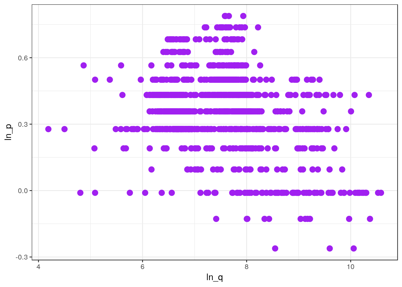
The next few examples show how to gradually add other elements to this plot.
Overlaying plots by groups
Suppose you want to color points in your plot according to some third variable that defines a particular category or group. In our data, we want to distinguish between weeks during which the brand ran a merchandising promotion compared to weeks when they did not.
First, we create a factor version of the merch variable. I like to use the prefix “D” for factor variables to help me keep them separate from the non-factor versions.
# Create the factor variable and add it to our data frame
df_mmaid12 = df_mmaid12 %>% mutate(Dmerch = factor(merch))

# Check the levels of the factor
levels(df_mmaid12$Dmerch)
[1] "0" "1"
Now we can create the plot by specifying the color of the dots to correspond to the level of the factor variable Dmerch.
ggplot(df_mmaid12, aes(x=ln_q, y=ln_p, color=Dmerch)) +
  geom_point()
Separate plots by group
Rather than overlaying the points across groups on the sample plot, we can create separate plots for each group. We can incorporate this aspect of a plot by adding it, via +, to what we have created so far:
ggplot(df_mmaid12, aes(x=ln_q, y=ln_p)) +
  geom_point() +
  facet_wrap(~ Dmerch, ncol = 2)
Note the precise syntax in facet_wrap() is to precede the variable that defines the groups with a tilde ~.
Line of best fit
Finally, let’s add a line of best fit (a simple regression line) to each facet of the plot. This represents the addition (using +) of a new geometry element:
ggplot(df_mmaid12, aes(x=ln_q, y=ln_p)) +
  geom_point() +
  facet_wrap(~ Dmerch, ncol = 2) +
  geom_smooth(method='lm', se=FALSE)    # Add line of best fit
We set the second argument to be se=FALSE to prevent the plot from depicting confidence bands around the line, which we did purely for aesthetic purposes.
Line plots
It should not be hard to apply what you have learned from the examples of scatter plots using geom_point() to line plots created using geom_line(). The only change we make to the example is that we will no longer plot ln(price) and ln(units)—this would not make sense as a line plot—but instead let’s examine how the price of 12-ounce Minute Maid varies over the weeks in the data.
Single line
Let’s look at the price over time in one particular zone:
# Subset the data for Low zone stores
df_mmaid12_low = df_mmaid12  %>% filter(zone == "Low")

# Plot using this subset -- these steps could have been combined
ggplot(df_mmaid12_low, aes(x=week, y=price)) +
  geom_line()
The plot shows our data range over about 400 weeks, during which time the price varies from a low of $0.75 to a high of nearly $2.00. However, the plot also reveals a peculiar pattern from around week 200 to week 270. Let’s take a look at some of the data in this week range to verify our suspicion.
df_mmaid12_low %>%
  filter(200 <= week & week <= 250) %>%
  kable()
zone week holiday brand size brand_size units price cost merch ln_p ln_q Dmerch —– —– ——– —— —– ———– —— —— —– —— —– —– ——-
The output from the code above probably looks a bit odd. That’s because there are no rows for weeks 200 to 250 (and a few more). The pattern in the plot is due to missing data, and so ggplot() connects whatever data points make the most sense to connect.
Overlaying multiple lines on one plot
Add more than one line (a new y-variable) to a plot with a common x-axis.
ggplot(df_mmaid12_low, aes(x=week)) +
  geom_line(aes(y=price), color="purple") +
  geom_line(aes(y=cost), color="blue")
Note: the code above illustrates a small, but important, change in our syntax. The aesthetic aes() passed to ggplot() defines the x-variable using week but no y-variable is defined. Instead, each geometry function, in this case two geom_line()’s, specify their own y-variables and colors. This works because each of the geom_line() functions are able to inherit the x-variable defined in the aesthetic for ggplot().
To help explain this a bit more, we could have fully specified the aesthetic within each of the geometry elements, even though this would have resulted in some redundant code. For example, the code below (not run) would produce the exact same plot.
ggplot(df_mmaid12_low, aes()) +
  geom_line(aes(x=week, y=price), color="purple") +
  geom_line(aes(x=week, y=cost), color="blue")
Separate lines by group
ggplot(df_mmaid12, aes(x=week, y=price)) +
  geom_line() +
  facet_wrap(~ zone, nrow = 2)
Histograms
Basic
Create a histogram using 20 bins to show the distribution of prices for the product in Low zone stores.
ggplot(df_mmaid12_low, aes(price)) +
geom_histogram(bins=20) 
Separate by group
Create separate histograms for each zone.
# Note this data frame is different than the last one
ggplot(df_mmaid12, aes(price)) +
  geom_histogram(bins=20) +
  facet_wrap(~ zone, nrow = 4)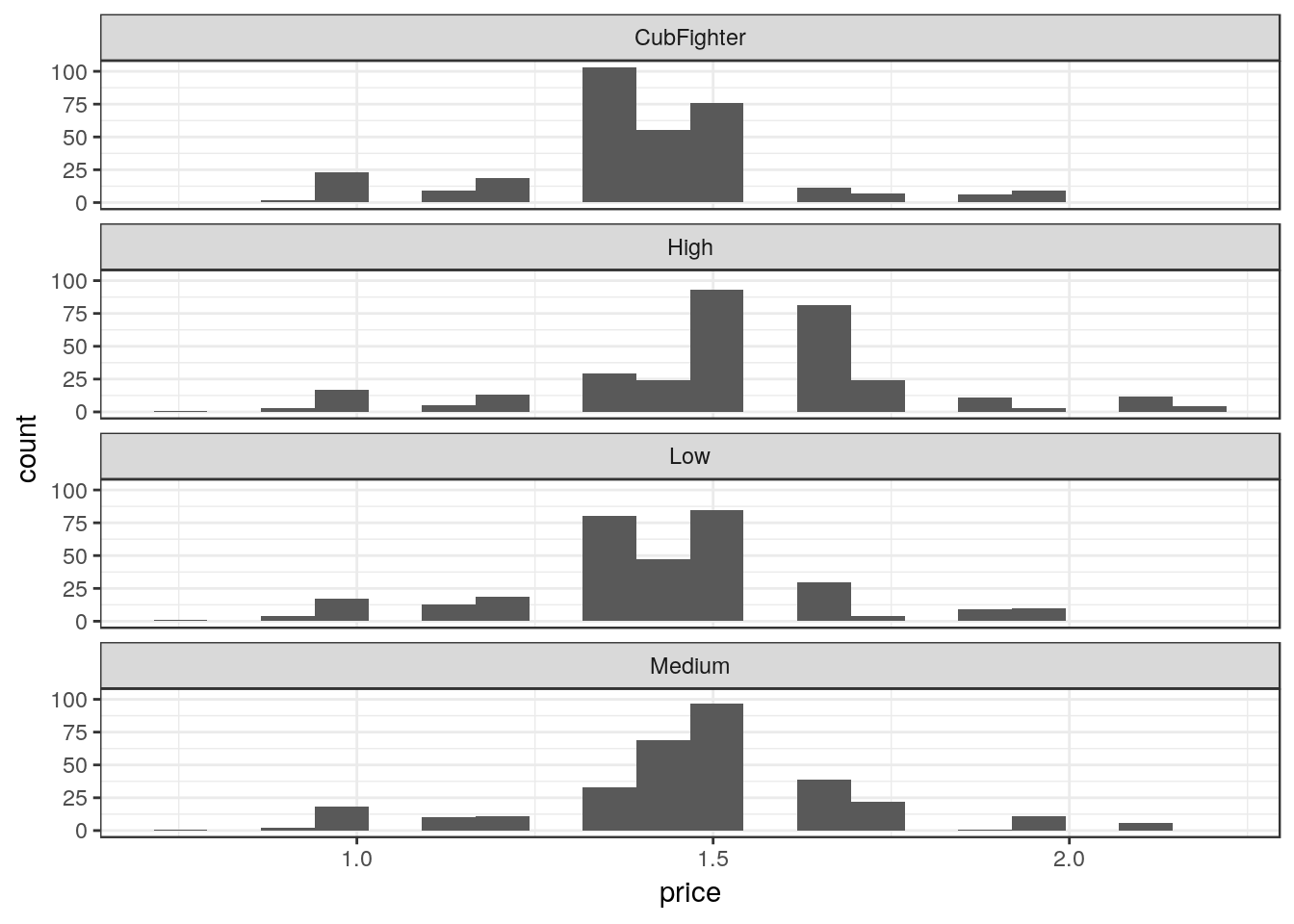
Data aggregation prior to plotting
The distribution of average prices (over stores in all zones) across all the weeks, specifying the bin width to be 0.1.
ggplot(df_mmaid12 %>%
         group_by(week) %>%
         summarize(mean_price = mean(price)),
       aes(x=mean_price)) +
  geom_histogram(binwidth=0.1)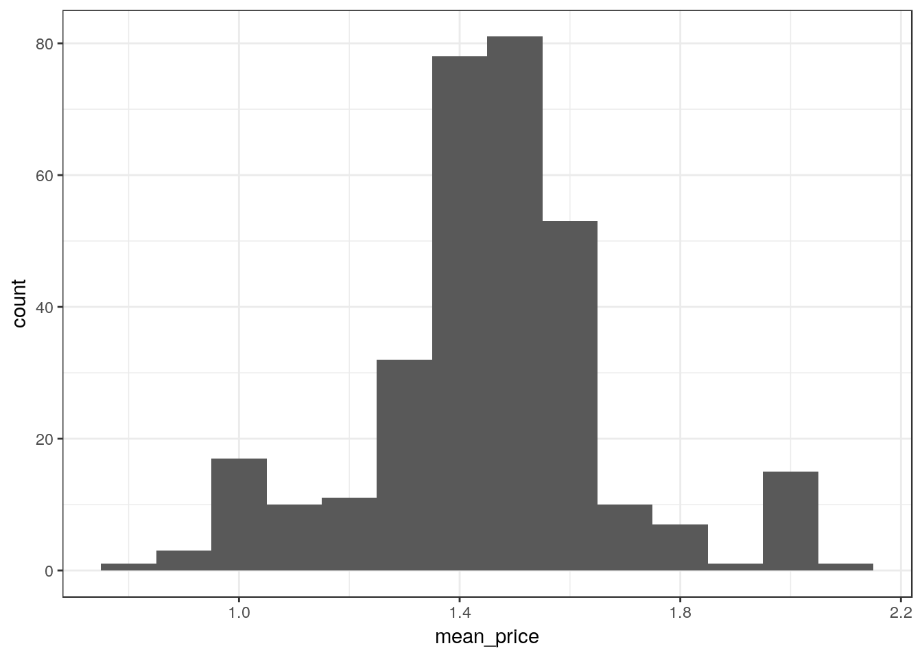
Bar plots
This creates a bar plot comparing the average units sold during holiday and non-holiday weeks:
ggplot(df_mmaid12 %>%
         mutate(Dholiday = factor(holiday)) %>%  # Create a new factor variable
         group_by(Dholiday) %>%                  # Group by holiday
         summarize(mean_units = mean(units)),    # Average units sold
       aes(x = Dholiday, y = mean_units)) +
  geom_bar(stat="identity")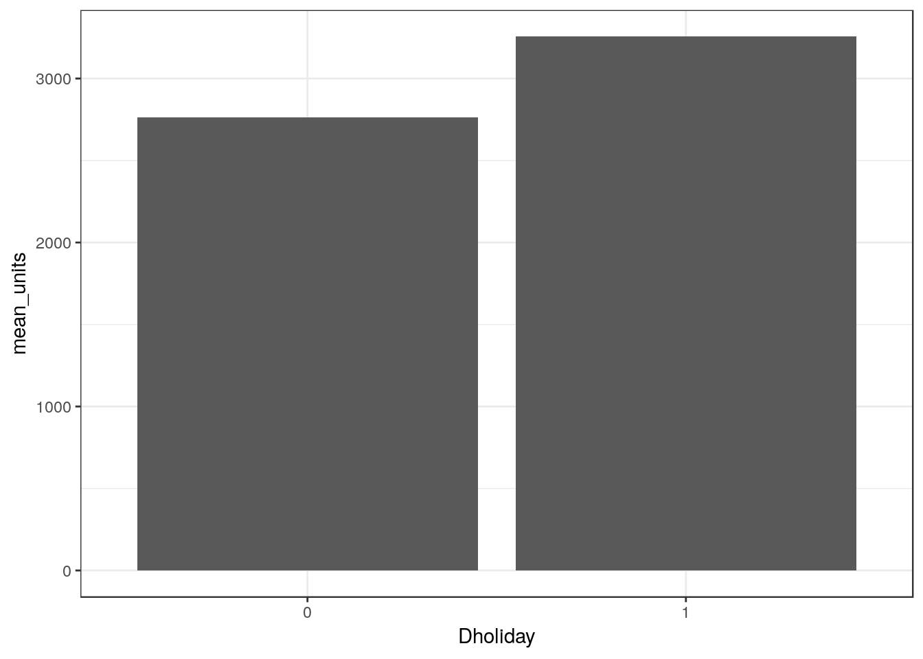
Note that we could alter this example, and some of the earlier examples, to make use of the interoperability of dplyr and ggplot. The code below would produce the same output as above (not shown).
df_mmaid12 %>%
  mutate(Dholiday = factor(holiday)) %>%
  group_by(Dholiday) %>%
  summarize(mean_units = mean(units)) %>%        # The data frame from this step
  ggplot(aes(x = Dholiday, y = mean_units)) +    # is piped into ggplot()
    geom_bar(stat="identity")
Regression
The primary function used for linear regression is lm(), which requires two key inputs: a formula and a data frame. The formula takes the general form of y ~ x1 + x2 + x3 + ..., where you can think of the ~ as similar to an = (but not in the sense when = is used to assign values, as in z = x*y). On the left-hand side of the formula, specify the name of the variable you are trying to predict. On the right-hand side, specify the variables you are using to predict y.
An important requirement is that all of the variables included in the formula should appear as columns (variables) in the data frame that you pass to lm().
Running a Regression
# This is the most basic regression form
# Note that the price coefficient does not make sense
reg_out = lm(ln_q ~ ln_p, data=df)
summary(reg_out)

Call:
lm(formula = ln_q ~ ln_p, data = df)

Residuals:
   Min     1Q Median     3Q    Max
-6.236 -0.858 -0.063  0.665  4.900

Coefficients:
            Estimate Std. Error t value Pr(>|t|)
(Intercept)   6.4935     0.0137   472.5   <2e-16 ***
ln_p         -0.5963     0.0288   -20.7   <2e-16 ***
---
Signif. codes:  0 '***' 0.001 '**' 0.01 '*' 0.05 '.' 0.1 ' ' 1

Residual standard error: 1.2 on 12510 degrees of freedom
Multiple R-squared:  0.0331,    Adjusted R-squared:  0.033
F-statistic:  429 on 1 and 12510 DF,  p-value: <2e-16
The variable reg_out represents a regression object, which stores various pieces of information based on the regression. For example, we can extract just the coefficients from the regression:
reg_out$coefficients
(Intercept)        ln_p
        6.5        -0.6
To see all the information in reg_out, use the attributes() function:
attributes(reg_out)
$names
 [1] "coefficients"  "residuals"     "effects"       "rank"
 [5] "fitted.values" "assign"        "qr"            "df.residual"
 [9] "xlevels"       "call"          "terms"         "model"

$class
[1] "lm"
A helpful point about saving the regression object is that we can reference its contents later. In R Markdown, I can reference the price coefficient in the text using “r reg_out$coefficients[‘ln_p’]” inside an inline code chunk, which, for example, makes it easier to report price elasticities in the text.
The summary() command prints an organized version of the regression model output. In many cases, unless we want to reference the output in the text, you can skip saving the regression output and wrap the lm() function in the summary() function, as in the next subsection.
Dummy variables
Often you will include dummy variables—sometimes referred to as fixed effects—to represent categorical variables. Sometimes these dummy variables will represent binary variables that are either zero or one (such as merch) and other times a collection of dummy variables will represent a more general discrete variable (such as year or brand).
If a variable is a character and you include it in a regression, R will automatically create a corresponding dummy variable:
summary(lm(ln_q ~ ln_p + merch + brand, data=df))

Call:
lm(formula = ln_q ~ ln_p + merch + brand, data = df)

Residuals:
   Min     1Q Median     3Q    Max
-5.483 -0.770 -0.009  0.670  4.868

Coefficients:
            Estimate Std. Error t value Pr(>|t|)
(Intercept)   5.5237     0.0423  130.67  < 2e-16 ***
ln_p         -0.0946     0.0293   -3.23  0.00124 **
merch         1.2190     0.0283   43.06  < 2e-16 ***
brandMMAID    0.6009     0.0435   13.82  < 2e-16 ***
brandSTORE    1.0649     0.0443   24.06  < 2e-16 ***
brandTROPI    0.1726     0.0453    3.81  0.00014 ***
---
Signif. codes:  0 '***' 0.001 '**' 0.01 '*' 0.05 '.' 0.1 ' ' 1

Residual standard error: 1.1 on 12506 degrees of freedom
Multiple R-squared:   0.2,  Adjusted R-squared:  0.199
F-statistic:  624 on 5 and 12506 DF,  p-value: <2e-16
However, if you need the variable to be a factor for some other reason (or if you wish to mimic Stata), you can explicitly create a dummy variable by converting to a factor. There are two ways to do this. One way is to explicitly create new variables in the data frame and then to include them in the formula:
df = df %>% mutate(Dmerch = factor(merch),
                   Dbrand = factor(brand))
summary(lm(ln_q ~ ln_p + Dmerch + Dbrand, data=df))

Call:
lm(formula = ln_q ~ ln_p + Dmerch + Dbrand, data = df)

Residuals:
   Min     1Q Median     3Q    Max
-5.483 -0.770 -0.009  0.670  4.868

Coefficients:
            Estimate Std. Error t value Pr(>|t|)
(Intercept)   5.5237     0.0423  130.67  < 2e-16 ***
ln_p         -0.0946     0.0293   -3.23  0.00124 **
Dmerch1       1.2190     0.0283   43.06  < 2e-16 ***
DbrandMMAID   0.6009     0.0435   13.82  < 2e-16 ***
DbrandSTORE   1.0649     0.0443   24.06  < 2e-16 ***
DbrandTROPI   0.1726     0.0453    3.81  0.00014 ***
---
Signif. codes:  0 '***' 0.001 '**' 0.01 '*' 0.05 '.' 0.1 ' ' 1

Residual standard error: 1.1 on 12506 degrees of freedom
Multiple R-squared:   0.2,  Adjusted R-squared:  0.199
F-statistic:  624 on 5 and 12506 DF,  p-value: <2e-16
Although there is no need to do so, you could also create a factor “on the fly” using factor() inside the regression equation:
summary(lm(ln_q ~ ln_p + factor(merch) + factor(brand), data=df))You may find this clarifies the behavior of R by making it explicit.
When you expect to use factors for other reasons, it will often be convenient to explicitly create factors.
Interaction variables
It is common to include interaction variables in a regression model, such as log(price) multiplied by a dummy indicating whether there is a merchandising event merch. There are two ways to include such interactions. Like adding dummies, one way is to first explicitly create the interactions variables in the data frame and to include them as regressors:
df = df %>% mutate(ln_pXmerch = ln_p*merch)
summary(lm(ln_q ~ ln_p + ln_pXmerch + merch, data=df))

Call:
lm(formula = ln_q ~ ln_p + ln_pXmerch + merch, data = df)

Residuals:
   Min     1Q Median     3Q    Max
-6.124 -0.764 -0.002  0.679  4.968

Coefficients:
            Estimate Std. Error t value Pr(>|t|)
(Intercept)   6.2073     0.0143  433.24  < 2e-16 ***
ln_p         -0.1925     0.0300   -6.43  1.3e-10 ***
ln_pXmerch   -1.6276     0.0678  -24.00  < 2e-16 ***
merch         1.4195     0.0320   44.30  < 2e-16 ***
---
Signif. codes:  0 '***' 0.001 '**' 0.01 '*' 0.05 '.' 0.1 ' ' 1

Residual standard error: 1.1 on 12508 degrees of freedom
Multiple R-squared:  0.165, Adjusted R-squared:  0.164
F-statistic:  821 on 3 and 12508 DF,  p-value: <2e-16
However, we could skip the step of creating ln_pXmerch. To create interactions “on the fly,” you can use a colon “:” between two variables, such as:
lm(ln_q ~ ln_p + ln_p:merch + merch, data=df)The lm() function will know to create an interaction between ln_p and merch based on the colon. These two regressions will produce identical output.
Dealing with many dummy variables
In data settings where you have many categorical variables that are converted into dummies, the output from lm() can be verbose. Below is an alternative regression function designed for such settings that represses this output.
library(lfe)  # "Linear Fixed Effects"
summary(felm(ln_q ~ ln_p + Dmerch | holiday + zone + size,
             data=df %>% filter(brand=="TROPI")))

Call:
   felm(formula = ln_q ~ ln_p + Dmerch | holiday + zone + size,      data = df %>% filter(brand == "TROPI"))

Residuals:
   Min     1Q Median     3Q    Max
-4.849 -0.407 -0.052  0.326  3.649

Coefficients:
        Estimate Std. Error t value Pr(>|t|)
ln_p     -1.0765     0.0964   -11.2   <2e-16 ***
Dmerch1   0.5693     0.0294    19.4   <2e-16 ***
---
Signif. codes:  0 '***' 0.001 '**' 0.01 '*' 0.05 '.' 0.1 ' ' 1

Residual standard error: 0.67 on 2851 degrees of freedom
Multiple R-squared(full model): 0.676   Adjusted R-squared: 0.675
Multiple R-squared(proj model): 0.209   Adjusted R-squared: 0.207
F-statistic(full model): 849 on 7 and 2851 DF, p-value: <2e-16
F-statistic(proj model):  376 on 2 and 2851 DF, p-value: <2e-16
*** Standard errors may be too high due to more than 2 groups and exactDOF=FALSE
This model includes fixed effects for holiday, zone and size, which are all hidden from the output. Only the dummy for merchandising events is reported.
Prediction
After running a regression, you can use the regression object to help make predictions. First, suppose we run a regression and save the resulting object:
reg_base = lm(ln_q ~ ln_p + ln_pXmerch + merch, data=df)Let’s figure out current sales by brand so we have a basis for comparison:
df %>%
  group_by(brand) %>%
  summarize(sum_units = sum(units)) %>%
kable()| brand | sum_units |
|---|---|
| CITHI | 832635 |
| MMAID | 4831259 |
| STORE | 9864500 |
| TROPI | 3101784 |
Now, let’s consider a what if scenario: what if Minute Maid increased its prices by 20%? To implement this scenario, we need to modify the price variable and any variables that depended on price. Before I modify them, I’ll also create a copy of our data, just to be safe, and store the scenario in a new data frame.
# Create a copy of current data frame
df_scenario = df

# Modify prices for Minute Maid
df_scenario = df_scenario %>%
  filter(brand == "MMAID") %>%
  mutate(price_orig = price,
         price = price*1.2,
         ln_p = log(price),
         ln_pXmerch = ln_p*merch)

# Use the regression to predict using the modified data
ln_pred_units = predict(reg_base, df_scenario)

# Convert from log(units) to units
df_scenario = df_scenario %>%
  mutate(units_scenario = exp(ln_pred_units))

# Calculate sales to see the effects of the price change
df_scenario %>%
  group_by(brand) %>%
  summarize(sum_units_scenario = sum(units_scenario)) %>%
kable()| brand | sum_units_scenario |
|---|---|
| MMAID | 2180752 |
Creating a table to compare regression results
After running a set of regressions, rather than including all of the raw regression output, it can be easier to collect this output in a single table. Fortunately, R makes it very easy to do this. Below we provide two examples of how to create tables.
The first appraoch requires that you install a new library. This should only take a moment and can be accomplished by entering the following line in the console:
install.packages("texreg")In the console, R might ask “Do you want to install from sources…” You can type “no” and hit enter.
To produce the table, you will need to specify an R code chunk option of results='asis'. Your R code chunk should look like the following:
    ```{ r, results='asis' }
    # The code goes here
    ```
The code below should be inserted into the chunk above. This code loads the texreg library, runs three regressions and collects their results in a list called regs, and then creates a table. A list is a data type that is similar to a vector, except that lists can store different data types in each element, whereas the elements of a vector must be the same data type.
library(texreg)   # Load the library
regs = list()     # Create an empty list object

# Store each regression in the list -- note the double brackets here
# whereas we used single brackets for vectors
regs[['Model 1']] = lm(ln_q ~ ln_p, data=df)
regs[['Model 2']] = lm(ln_q  ~ ln_p + merch, data=df)
regs[['Model 3']] = lm(ln_q  ~ ln_p + merch + ln_p:merch, data=df)

# Create the table using htmlreg to match output format
tbl.out = htmlreg(regs, caption='My Regression Models', label="table:models",
                  doctype=FALSE)
print(tbl.out)| Model 1 | Model 2 | Model 3 | ||
|---|---|---|---|---|
| (Intercept) | 6.49*** | 6.30*** | 6.21*** | |
| (0.01) | (0.01) | (0.01) | ||
| ln_p | -0.60*** | -0.51*** | -0.19*** | |
| (0.03) | (0.03) | (0.03) | ||
| merch | 1.04*** | 1.42*** | ||
| (0.03) | (0.03) | |||
| ln_p:merch | -1.63*** | |||
| (0.07) | ||||
| R2 | 0.03 | 0.13 | 0.16 | |
| Adj. R2 | 0.03 | 0.13 | 0.16 | |
| Num. obs. | 12512 | 12512 | 12512 | |
| RMSE | 1.22 | 1.16 | 1.13 | |
| p < 0.001, p < 0.01, p < 0.05 | ||||
The output of texreg() can be seen in the table. For more details on how to customize the output, please refer to the texreg() documentation.
The second method is to create a table directly in Markdown. This might be useful if you don’t want to include the rest of the regression output, and if you want to add other elements to the table (comments, formatting, etc.). First, using the regression results above, I’ll extract the price coefficients:
elas1 = regs[['Model 1']]$coefficients['ln_p']
elas2 = regs[['Model 2']]$coefficients['ln_p']
elas3 = regs[['Model 3']]$coefficients['ln_p']
Now I’ll create a table in R Markdown. For example, Markdown text that appears like this…
| Model        | Elas                | Comment        |
| ------------ |:--------:| --------------:|
| Model 1      | -0.6 | not good       |
| Model 2      | -0.51 | slightly worse |
| Model 3      | -0.19 | terrible       |
… will appear like this when you knit the document:
| Model | Elas | Comment |
|---|---|---|
| Model 1 | -0.6 | not good |
| Model 2 | -0.51 | slightly worse |
| Model 3 | -0.19 | terrible |
Fortunately, Markdown is not picky about aligning the dashes - and pipes | with the text. Please refer to the link above for more on the formatting.
The
c()function will also create a list if the elements are of different data types.↩You can generally replace all occurrences of
<-with=, but you should not do the opposite.↩See the R for Data Science tutorial for much more information.↩
You may notice the term “tibble” in the output from
head(df). A tibble is a “a modern reimagining of the data.frame” within thetidyverse. You will probably not need to worry about the differences between a data frame and a tibble. We will solely use the term “data frame”.↩See http://uc-r.github.io/dplyr for more on data manipulation with
dplyr.↩See http://uc-r.github.io/pipe for more on
%>%.↩The “gg” in
ggplot2actually stands for “Grammar of Graphics.”↩
Copyright © 2018 Brett Gordon and Robert McDonald. All rights reserved.